Props
Role
Copywriter, UX Researcher, and Content Strategist
Timeline
10 days
Tools Used
Figma, Google Docs, Contentful
Stakeholders
Lead designer, Frontend Developer
A crucial part of this project was conducting UX research and developing the website's content strategy and tone while engaging with users.
Overview
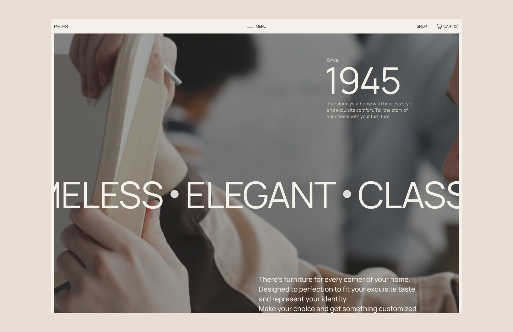
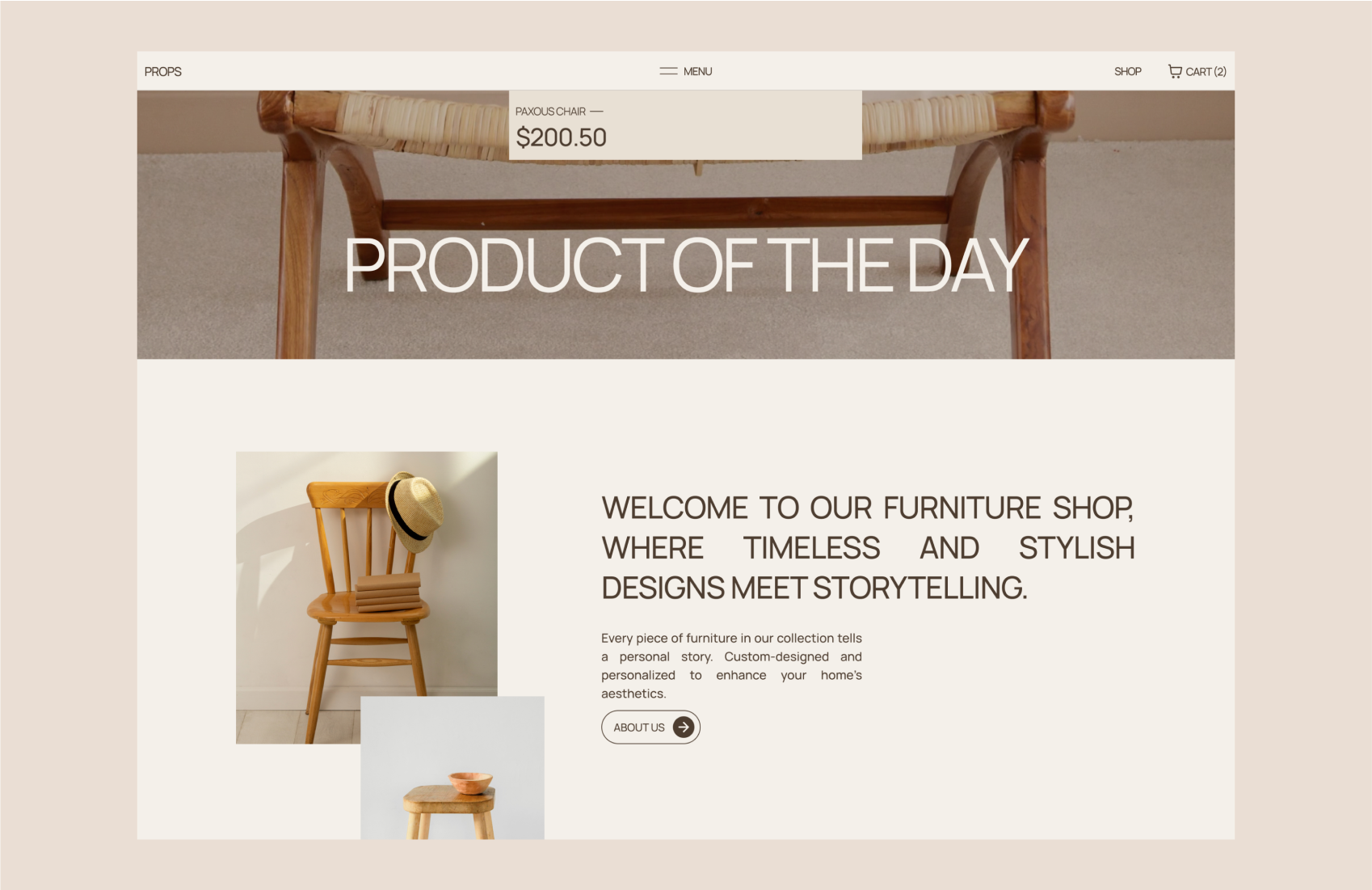
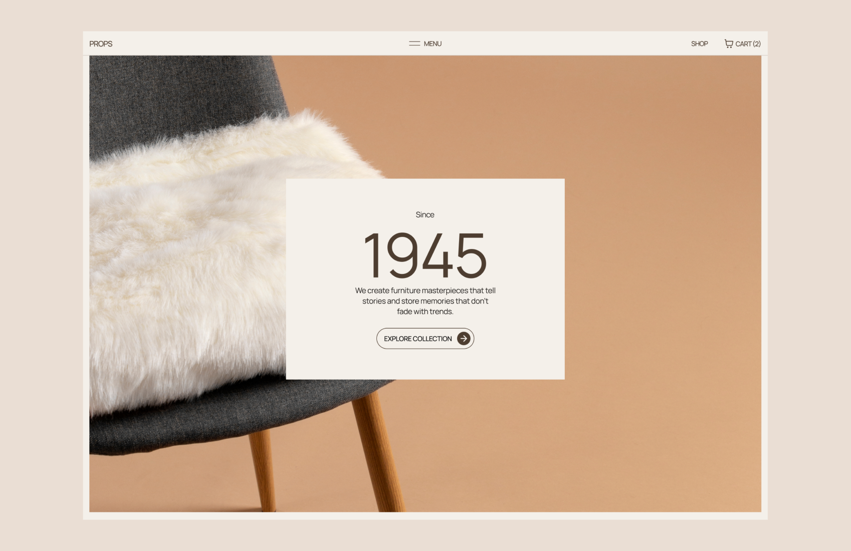
Props is a showcase website for a fictional furniture company created by a Lagos-based design firm to establish them as leaders in the industry.
Understanding the Brand
After speaking with the team and understanding their desired values, we shaped the brand's personality to reflect timelessness, style, individuality, and craftsmanship.
Tone and Voice
Based on our discussion, I recommended a warm, sophisticated tone to connect with users emotionally. The team agreed.
Identifying the Key Idea
To create compelling content, we needed a central idea. I followed these steps: - I identified Props Furniture's main problem. - I analyzed what makes Props unique. - I researched the market for more qualities.
Unique Selling Points
Based on the research, I identified the following unique selling points: - Customization: Furniture tailored to individual preferences. - Timeless Design: Style that never went out of fashion - Craftsmanship and Quality: Attention to detail and use of high-quality materials. - Storytelling and Memories: Furniture that tells personal stories and creates cherished memories. - Functionality: Furniture that combines beauty with practicality. - Attention to Detail: Careful craftsmanship and precision. - Enduring Value: Furniture that lasts a long time
Emotional Benefits
To make these unique selling points relatable, I focused on how they benefit users emotionally. I asked questions like: - Why is this feature unique? - How does it solve a problem? - What pain points does it address? - When does it matter the most? - Why would users want this?
Understanding the Audience
After receiving input from the team, I researched to identify the target audience for Props. I created a profile of the ideal customer. They were homeowners who valued elegance, style, and individuality. They cared about personalized furniture that could be passed down through generations. They were interested in interior design, craftsmanship, and creating unique living spaces.
Challenges
After consulting with the team, I discovered that the previous website copy failed to position the brand as a leader in the industry. The main issues were as follows: - It didn't clearly show the brand's timeless style and personalized storytelling. - It didn't create an emotional connection with potential customers. - It didn't highlight the craftsmanship and high-quality materials used. - It didn't differentiate Props from competitors or showcase its unique selling points. - It didn't make it clear that the company was fictional.
My Solutions
To tackle the challenges at hand, I implemented the following solutions: - Developed a catchy tagline: "Where Style Endures: Timeless Furniture for Your Story." - Crafted compelling and elegant copy to showcase the brand's values. - Incorporated storytelling to evoke emotions and help users imagine their own stories. - Emphasized the craftsmanship and attention to detail in each furniture piece. - Highlighted the unique qualities of Props Furniture and its customization options.
After UX


Outcome
As a result of these changes, the website received positive recognition. It received the Site of the Day award on Awwwards. It was featured on other websites focusing on design and web development. The use of storytelling helped to create an emotional connection with users, which resulted in higher engagement and increased conversions.

