Sunbeam website
Role
In-house UX writer
Timeline
14 days
Tools Used
Figma, Google Docs, Contentful
Stakeholders
Lead designer, Frontend Developer, CEO
A crucial aspect of this project was to establish the content strategy and tone of voice for the company's inaugural website in line with its business objectives and values.
Overview
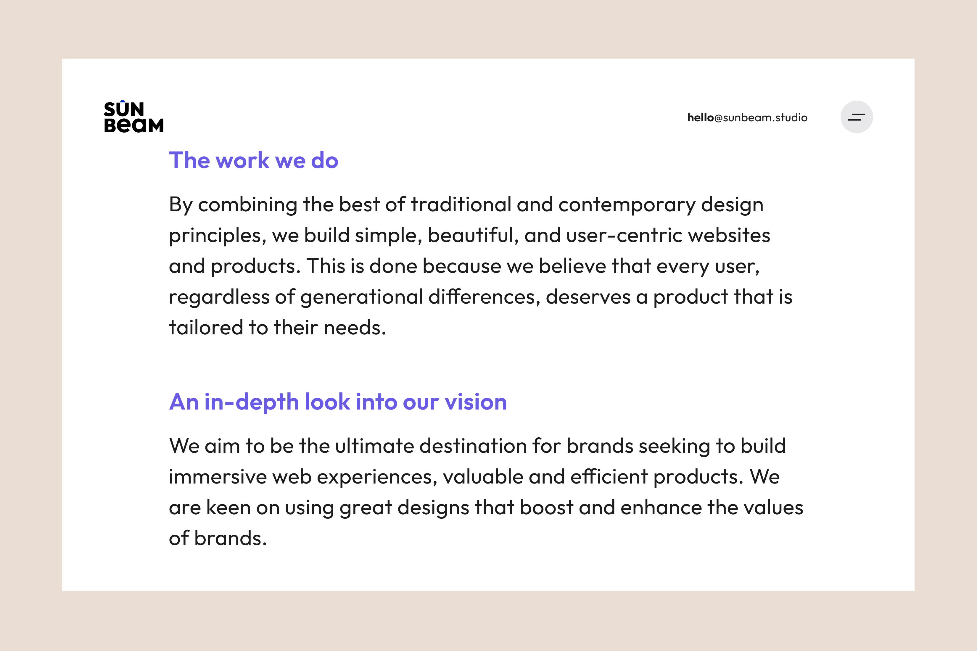
Sunbeam combines traditional and contemporary design principles to create visually appealing and user-friendly products and websites with a youthful and creative approach.
Scope
As a UX copywriter, I was responsible for creating the brand story and website copy, including the brand book, tagline, case studies, and FAQs, and defining the company's voice and tone.
Persona
Sunbeam appeals to a generation that values wit, adventure, and vibrant aesthetics. They create visually appealing products and websites that prioritize usability.
Tone and Voice
To give Sunbeam a unique and recognizable personality, I took into account its principles, concepts, vocabulary, grammar, punctuation, and capitalization. This allowed me to create a tone spectrum consistent throughout the user's journey and cater to every stage of their interaction with the brand.
My Challenges
It took a lot of work to balance practical UX principles with business requirements. One of the challenges faced was finding appropriate language that would resonate with younger and older users.
My Solution
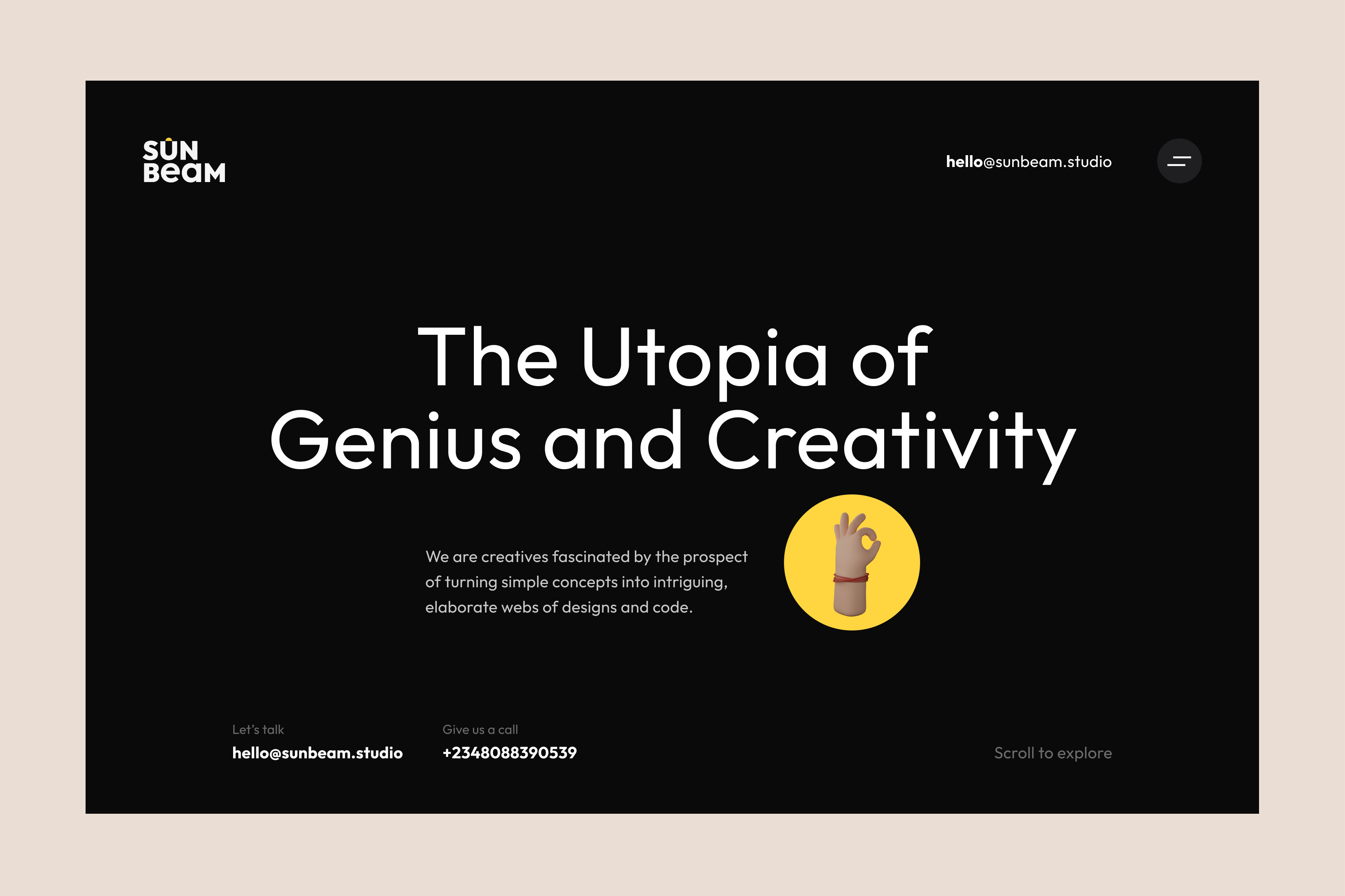
I created the tagline "The utopia of genius and creativity" for Sunbeam. This tagline captures the essence of a team of young creatives who are passionate about their craft. They embrace a world where mistakes are acceptable and creativity knows no bounds—a utopia.
Content Testing
Assisting users in achieving their goals was the ultimate priority while expanding vocabulary and pleasing clients were important. For better readability, I aimed for an 8th-grade reading level according to the Flesch-Kincaid scale. This ensures that 85% of the general public can understand the content without a dictionary. I conducted a cloze test to measure comprehension by replacing every sixth word with a blank to assess the ability to predict missing words and understand the primary context.
Fun fact
This project has expanded my vocabulary and taught me new words, which is an interesting fact. I have also learned to use them correctly in sentences, which has enhanced my language skills.
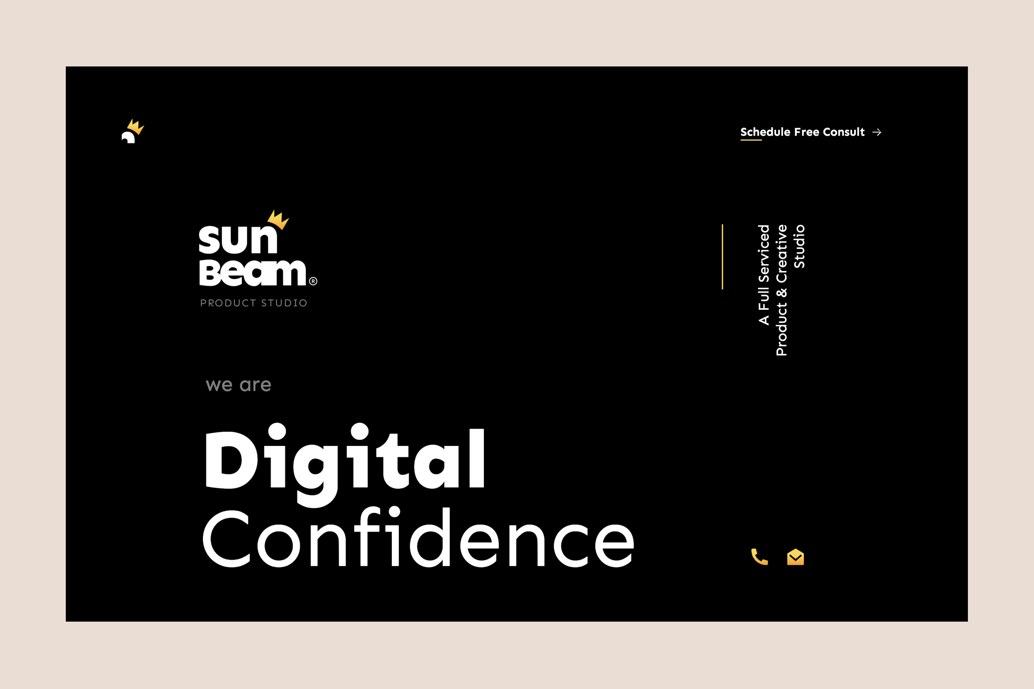
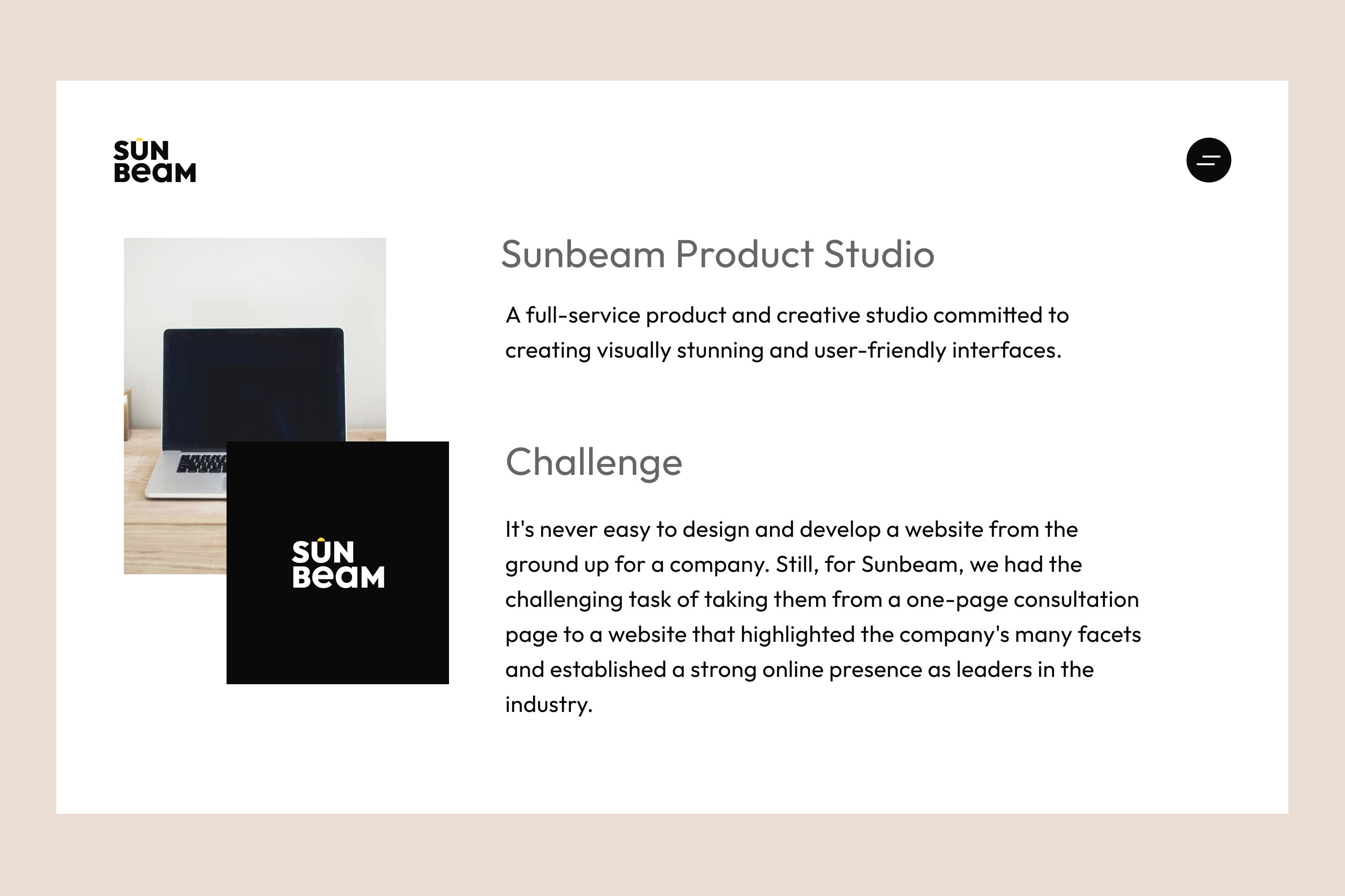
Before UX


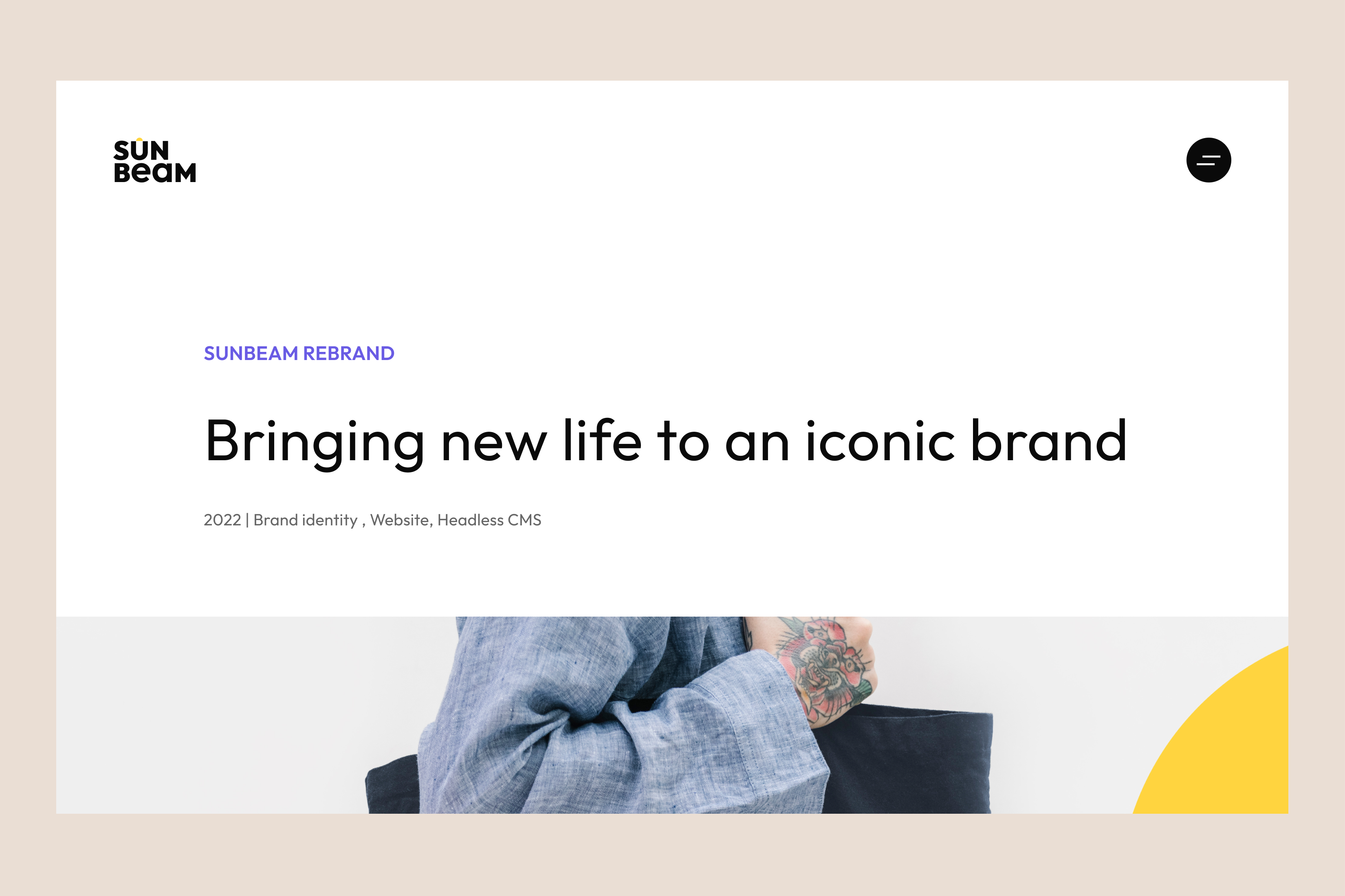
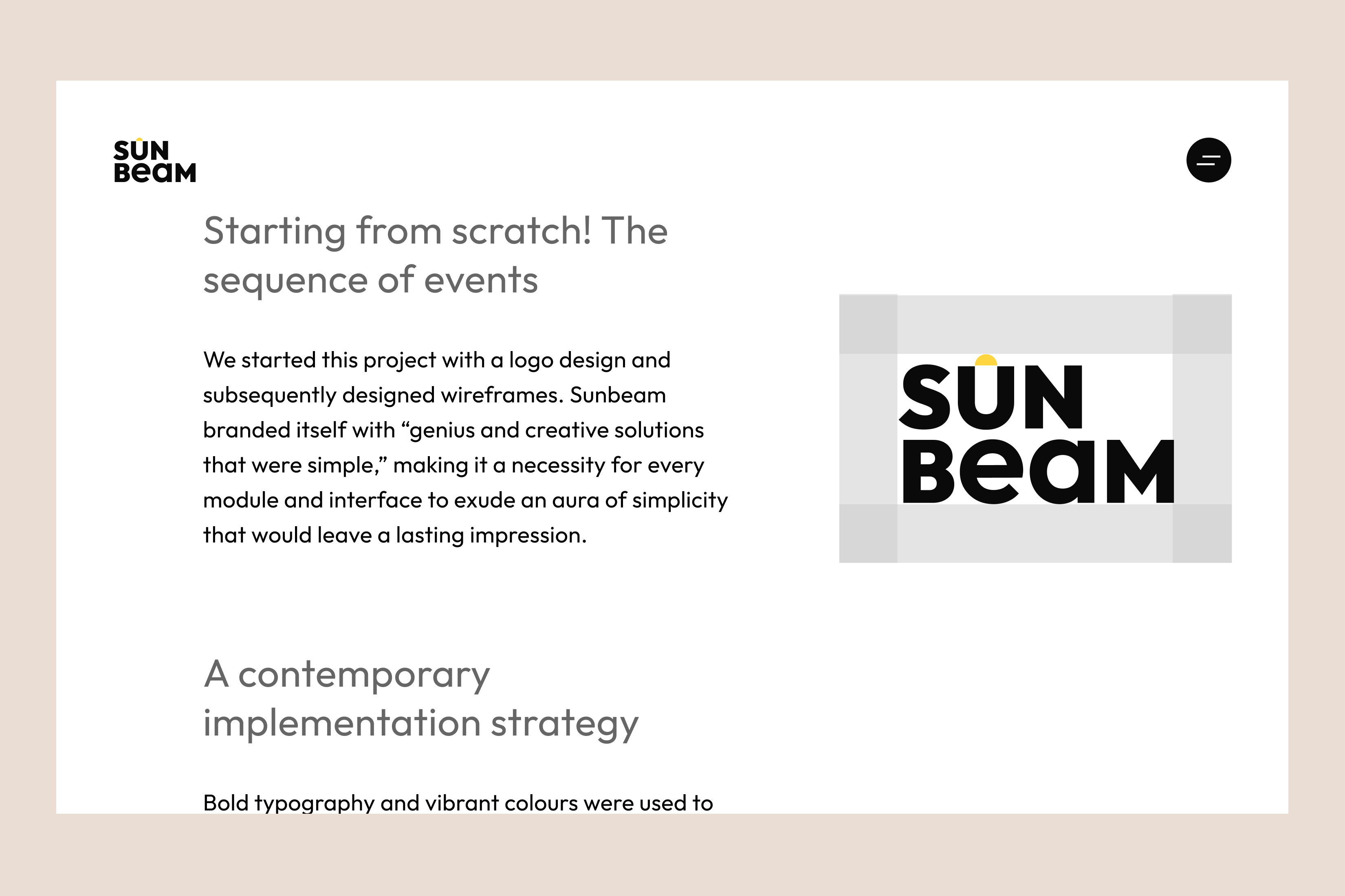
After UX
Outcome
The test results confirmed that the copy was clear, easy to understand, and met the needs of both the team and users. I will use Google's UX HEART framework to track success metrics, including Happiness, Engagement, Adoption, Retention, and Task Success. Additional metrics will include website traffic, repeat visits, and call-to-action performance, such as inquiries and conversions.

